Hastings Beer and Music Festival is a 4-day annual event encompassing film, DJs and live music.
We had worked with the HBMF team (Hastings Round Table) for a previously but in 2019 really stepped up the support with a brand new website and a new look for the social media assets.
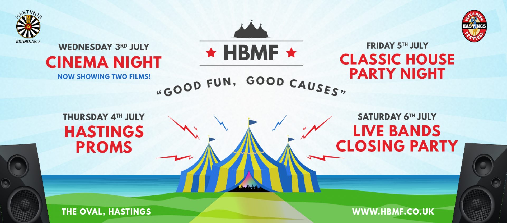
Following changes made in 2018 where a cinema night was added plus a new club classic event on the Friday, 2019 sees further positive and exciting changes to the event. The cinema night has been extended to show 2 films, The DJ night has been added to the line up with more big-name DJs and the Saturday event now becomes an all-day event with bands on from midday until 11 pm. On top of this, the proms night is celebrating 10 years so 2019 is geared up to be a fantastic event.
New-Look Graphics
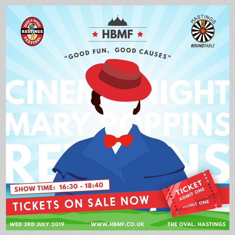
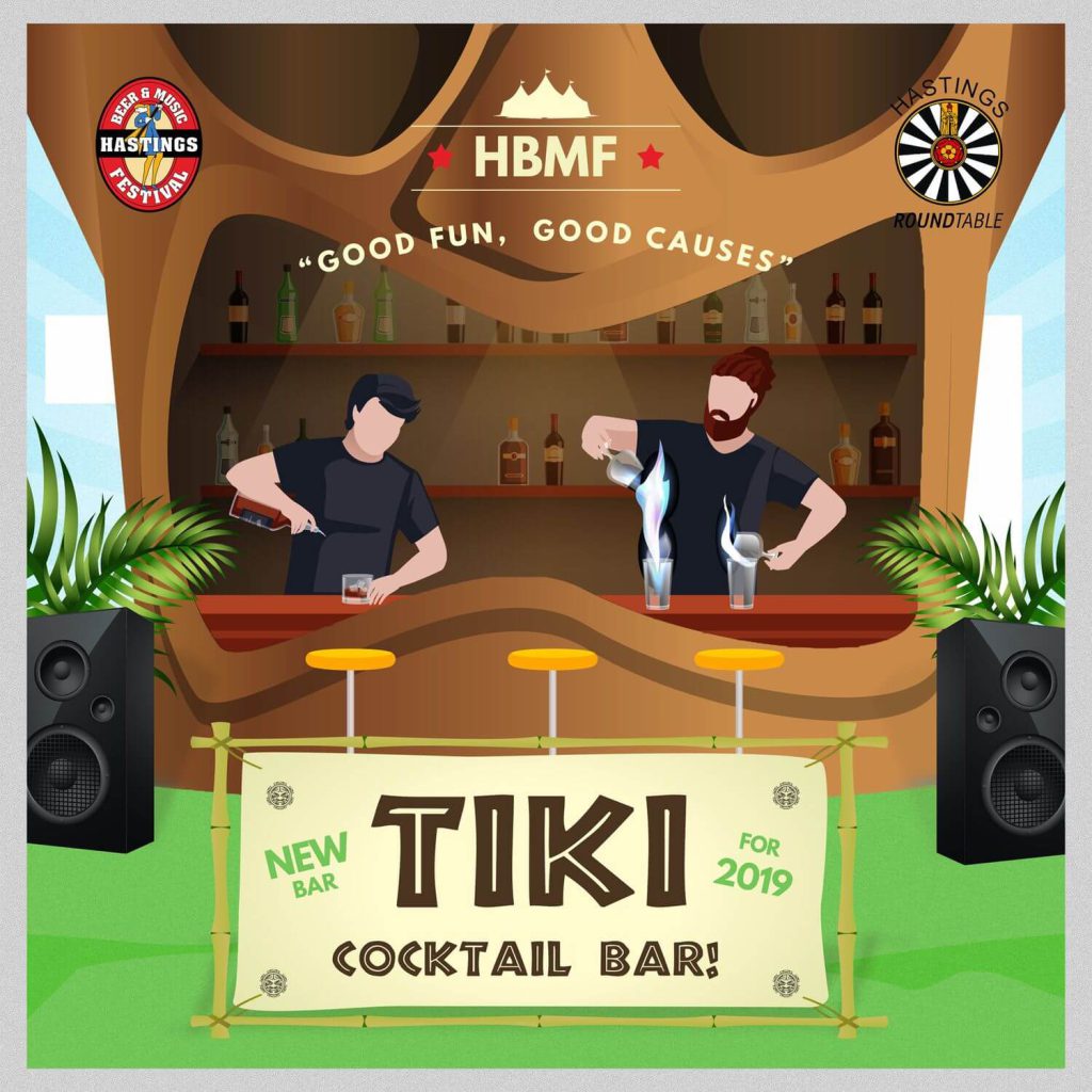
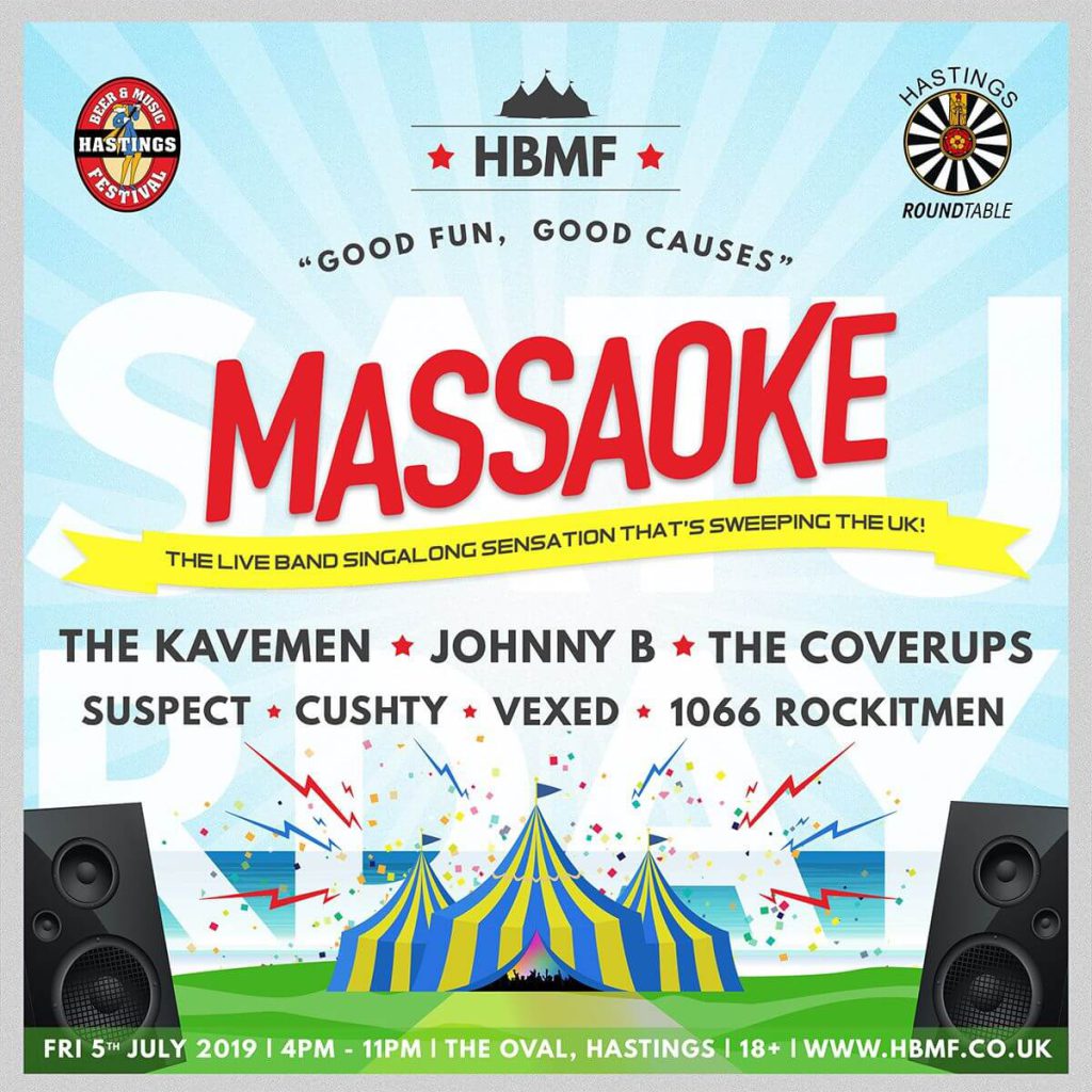
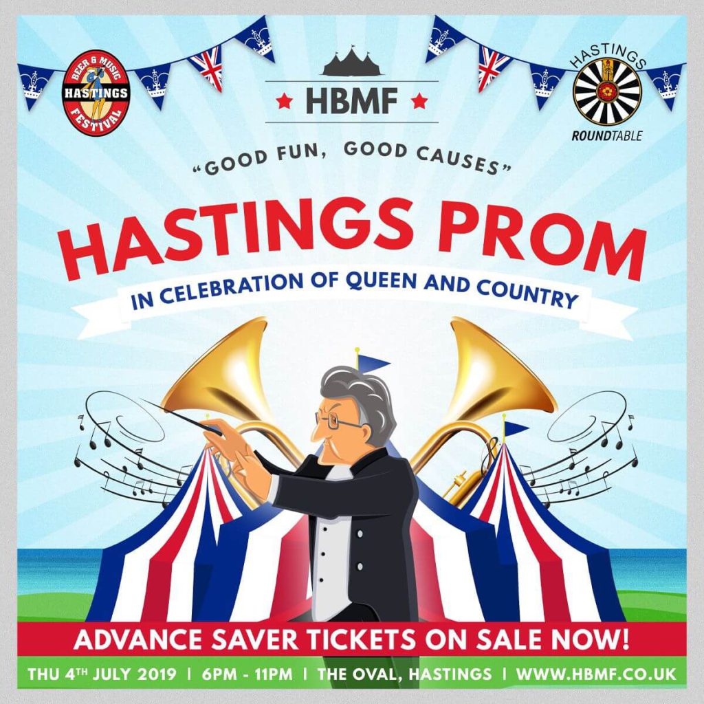
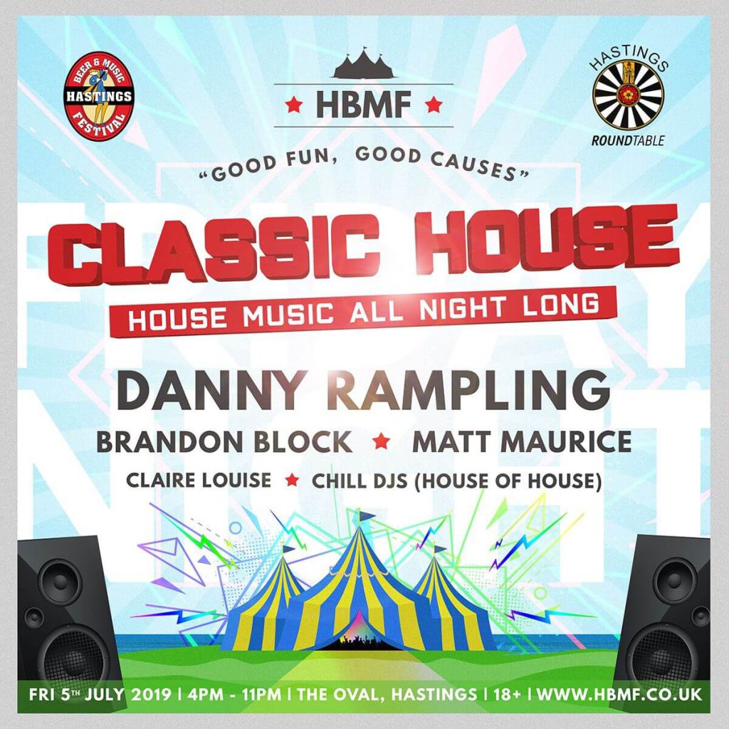
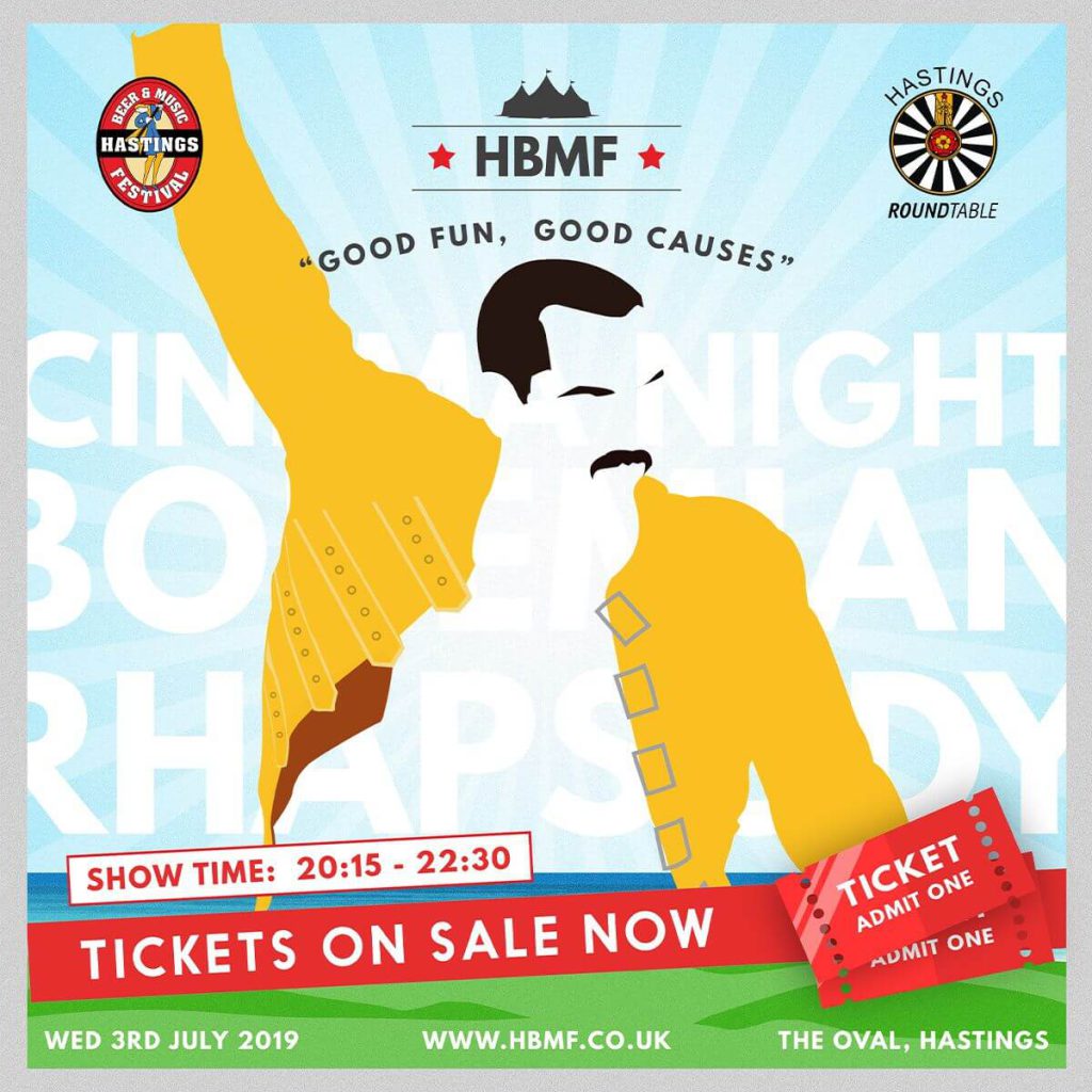
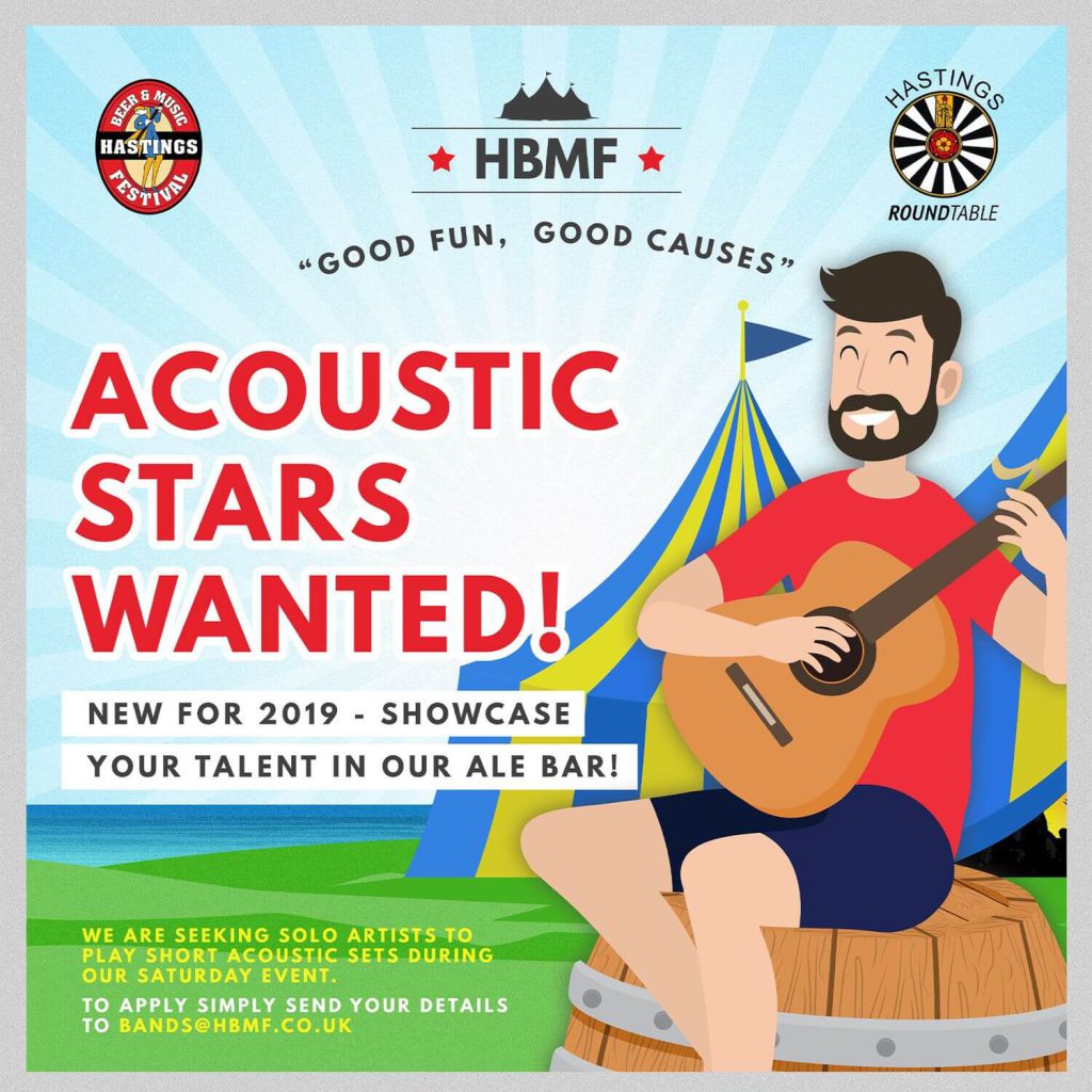
The task was to design a clear brand direction for all posts. With the size and format being similar across all the assets, we first looked to create a “top and tail” or “empty belly” type design which would have a consistent header and footer and leave space in the centre for the main details.
This would then ensure all posts, regardless of if they were for a specific event, a competition or an important announcement would still be recognisable as the Hastings Beer and Music Festival Brand.
8 Page Brochure.
A new item that the HBMF team invested in this year was an 8-page brochure which was delivered to over 20,000 local households and included a discount code for tickets. The brochure complemented the online efforts of social media and ensured the whole town knew what events were going on. On top of the social posts and brochure, our graphic design team created the designs for the custom printed beer glasses and some of the advertiser’s banner designs.
Charity Focused Website Design
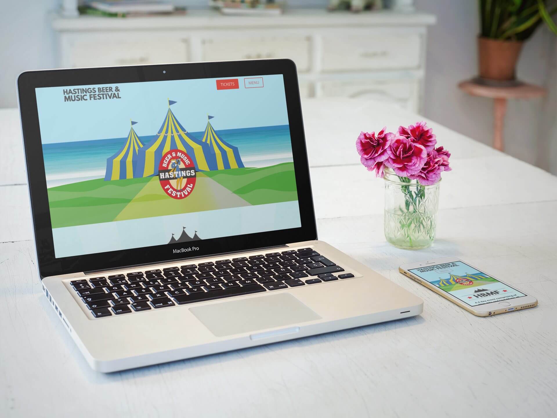
We looked after the website design and technical support for the website for the 2019. Taking influence from the designs created for social media we followed the same colour scheme and carried many assets across to ensure that visitors landing on the website from social media were kept on brand. With an emphasis on selling tickets, we stripped back the menu to provide 2 clear buttons. One to purchase tickets and one to open the main menu. This allowed visitors to get the right page as quickly as possible. With a large amount of traffic likely, we ensured the site had all the resources it needed by setting up its own VPS (virtual private server) which was monitored 24/7.

