A playful font such as Fredoka, especially when used for headings, can work brilliantly for fun websites or those appealing to children’s services such as nurseries and kids’ clubs (we don’t dare mention Comic Sans), whereas a professional service may suit something cleaner like Poppins or Lato (or even a Serif like Playfair Display for headings).
So, we have been excited to see that Microsoft is replacing their default font for the first time in 15 years.
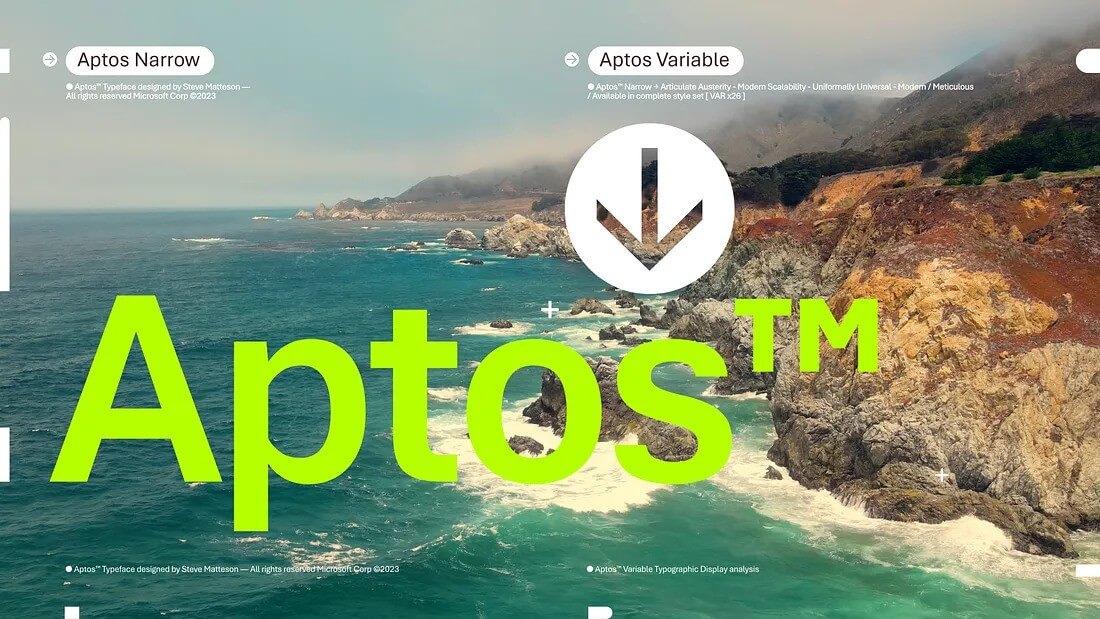
It’s goodbye Calibri and hello Aptos.
This default font is now included in popular apps such as Word and Outlook and is being introduced to “make them easy to read, look more professional, and easy to navigate,” according to Jess Kwok, a Product Manager for Microsoft 365 apps.
The designer behind Aptos is Steve Matteson, the same creative mind who brought us the iconic TrueType fonts in Windows 3.1 – yes, we’re talking about classics like Times New Roman, Arial, and Courier New. He’s also the guy behind Segoe, which has been the face of Windows since the Vista days and even adorns Microsoft’s current logo. It could be argued that this is Microsoft playing it safe by using Steve Matteson, but I feel it is the right choice in this instance.
Matteson describes Aptos as ‘Helvetica with a bit of a human touch‘.
Aptos comes in various styles – think condensed, monospaced, and even serif – giving Apple’s San Francisco typeface a run for its money.
But for those of you who are thinking, ‘I like my old fonts!’, don’t worry. All the classic fonts are still there. You can easily stick with them or tweak your default settings if Aptos doesn’t float your boat just yet. After all, change is good, but sometimes the classics are like a comfy pair of shoes that you can’t give up on just yet.


